Top Ten Tuesday
This is a weekly Meme hosted by The Broke and the Bookish Where Fellow Book Bloggers Share The Top Ten of The Given Subject.
Ten Things That I Like/Dislike On Book Covers
Like
1. A cover where the image clearly represents the plot line of the book.
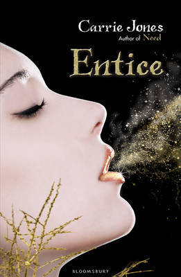



Entice - Pixies that leave gold dust, cold setting, love & romance all shown
Earthfall - Aliens
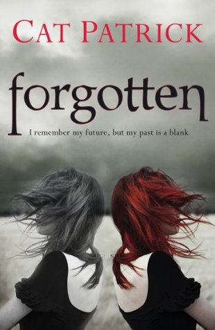
Forgotten - Past is blank but can tell the future.
Wings - they are Flowers!
2. A cover with text that stands out against the background.


3. Swanky fonts.
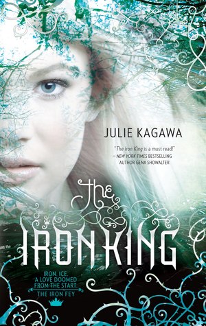


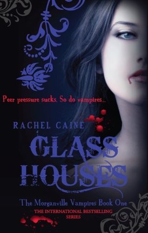
4. Swirls, I'm a sucker for swirls!
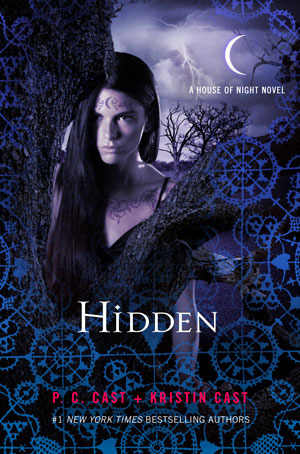
Iron King, House of Night and Morganville (Above) are all also very good at having swirls on their cover.


5. Shiny, I do like a book that is shiny! But saying that I think I must be half magpie because I do love shiny things...


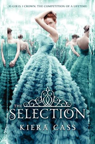
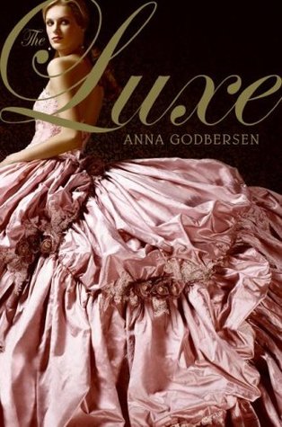
6. Pretty Dresses


Dislike
7. Artwork, I prefer photographs or computer generated images (Unless it's done really well A.K.A Harry Potter & Percy Jackson)


8. Boring square font placed at the top/bottom of the cover sometimes in a coloured box.


9. Images that do not represent the genre of the book
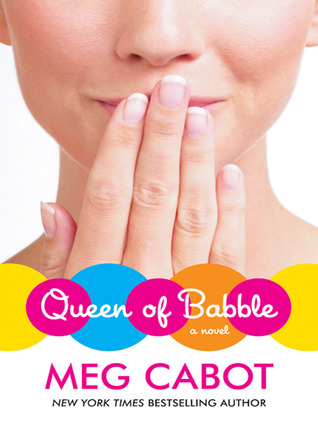


Queen of babble is an Young Adult/Adult novel.... It looks like a children's book. Air Head is another example of this, a YA book that looks like Children's. The Fire looks like an adult novel to me where in reality it is aimed at Young adults and older children.
10. Too Cheesy that it makes me shudder!



Labels: Top Ten Tuesday


1 Comments:
Covers need to show you what the book is about, otherwise I'll get annoyed because I have been misled! I like the "cheesy" one, exactly what I was thinking.
Post a Comment
Subscribe to Post Comments [Atom]
<< Home